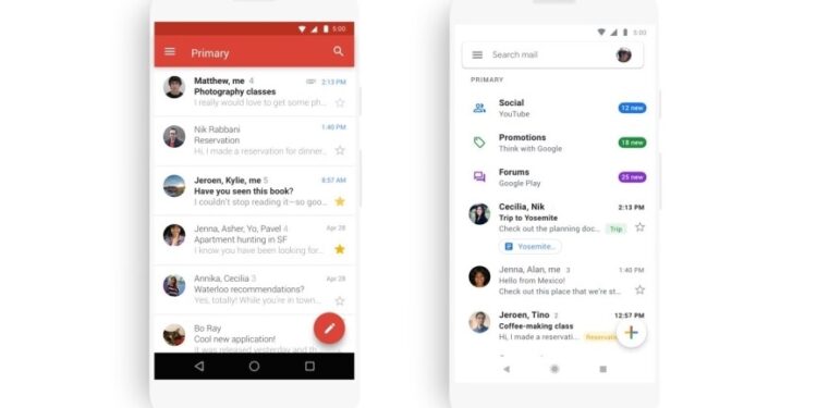
If you’ve been feeling that the Gmail App was a bit of a messy affair, you’re not the only one. Luckily for us mobile users, Google has updated its app to a cleaner, all-white look and feel.
Google opted for an all-white, distraction-less approach to the new Gmail app, based on the Material Theming, first launched in 2014, which laid the foundations for the new looks. Material is a set of rules used which provides UI designers with a framework of methodologies on how to approach color, typography, iconography and interaction during app development phases.
While Material is known for recommending discernible, bold blocks of functionality, this time Google opted for an all white look in its app. No more bold red ribbons or buttons, but rather subtle minimal ‘+’ signs and discreet inbox labelling. Functionality remains the same, but some may raise an eyebrow with Google’s radical rethinking of the app’s look and feel.
Some new extras are in the box, as well. For instance, Google has added a very useful attachment preview feature, which appears below the messages. Moreover, “comfortable” and “compact” mailbox density options have made their way to the app from the web, along with phishing alerts; the latter being possibly the only flashing red addition.
Visually speaking, the new Gmail app feels better aligned to the recent design upgrades which appear in the web version. Even though Google should expect a bit of a backlash, the truth is that it looks cleaner to the eye and it even alludes to a future dark/light mode.
The updates have gone live today on both Android and iOS and are expected to be globally available within the course of the next couple of weeks.


